

Choosing the Right Colour Palette for Your Acrylic Benchtop


Selecting the right colour for your benchtop is one of the most impactful design decisions you’ll make in a kitchen or bathroom renovation.
The colour you choose influences the perceived size of the space, complements cabinetry and flooring, and sets the overall tone of the room.
Whether you’re drawn to crisp whites, warm neutrals, or deeper, dramatic tones, making a confident choice involves balancing aesthetics, practicality and long-term appeal.
Here’s how to approach colour selection — with specific guidance for acrylic solid surface benchtops.


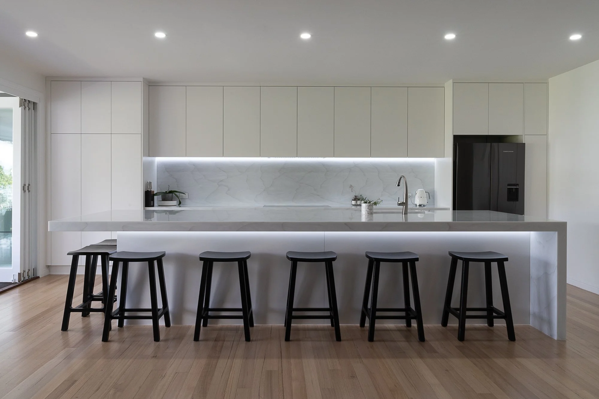
Colour Principles for Benchtops (What Design Research Shows)
Design professionals generally agree on a few core principles when selecting benchtop colour:
1. Light colours make spaces feel larger and brighter
In kitchens with limited natural light or smaller footprints, lighter surfaces help reflect light and create an open, airy feel. Soft whites, creams and pale greys are popular for this reason. (“Benchtop Materials & Colours Guide”, Houzz NZ)
2. Contrast adds visual interest
Pairing a darker benchtop with lighter cabinetry — or vice versa — adds depth and contrast, anchoring the design. A balanced contrast can help define zones in an open-plan space.
3. Continuity creates calm
Using similar tones across benchtops, cabinetry and splashbacks creates a harmonious look that feels intentional and cohesive. This is especially effective in modern, minimalist or Scandinavian-inspired spaces.
4. Undertones matter
Colours have subtle warm or cool undertones, which interact with your cabinetry, flooring and lighting. Testing samples in your actual space is critical because a tone that looks neutral on a showroom display can pick up pink, blue or yellow casts depending on light.
5. Trends vs Timelessness
While bold colours can be appealing, classic neutrals (whites, greys, taupes) tend to age well and are easier to pair with future décor changes.


Why Colour Choice Matters for Acrylic Benchtops
With acrylic solid surface, the colour selection isn’t just aesthetic — it also affects perceived texture, light reflection, and how wear is perceived over time.
Acrylic has several advantages when it comes to colour:
Deep, consistent pigmentation: The colour goes through the material (not just a surface layer), making scratches or wear less noticeable compared to some laminates.
Seamless appearance: Unlike stone, where veins can intersect awkwardly at joins, acrylic’s uniform palette looks cohesive across long runs and features like islands or waterfall ends.
Range of contemporary finishes: From marble-inspired veining to subtle stone-look textures and solid neutrals, acrylic offers both classic and modern aesthetic choices.
Choosing Colours Based on Your Space
Here are practical strategies based on common kitchen/bathroom conditions:
Light and airy kitchens
If you have plenty of natural light, you can experiment with mid-tone colours without feeling weighed down. Soft greys, dove tones or muted stone finishes work well.
Smaller spaces or low light
In kitchens or bathrooms with limited windows, go for lighter shades like warm whites or pale neutrals to make the space feel larger and brighter.
High-contrast designs
Dark islands paired with lighter perimeter benchtops are trending. Darker acrylic finishes (charcoal, slate, deep greys) ground the space and can create a striking focal point — especially against light cabinetry.
Classic elegance
Marble-inspired acrylic finishes add subtle veining without the maintenance needs of real stone. These palettes work beautifully with both traditional and transitional cabinetry.


Practical Tips Before You Decide
Test in your home
Take samples home and observe them at different times of day. Light quality, room orientation, and even wall colours influence how a finish reads in your space.
Consider lighting temperature
Cool (blue-white) lighting can make some colours feel stark, while warm (yellow) lighting brings out cosy, earthy undertones. Test samples under your actual lighting.
Balance pattern with simplicity
Busy patterns can hide minor spills and crumbs, but too much texture may clash with other design elements. Subtle patterns often hit the sweet spot between practicality and style.
Coordinate with splashbacks
If you’re using acrylic for both the benchtop and splashback, choosing a matching or coordinating tone creates a seamless, unified look.
Final Thoughts for Otago Homes
In Queenstown and Wanaka’s bright, open spaces, softer neutrals and stone-inspired palettes are popular because they balance light and contrast beautifully. In Dunedin’s more classic homes, warmer tones can complement traditional cabinetry while still offering a contemporary feel.
With acrylic solid surface, you get design flexibility, consistent colour, and easy maintenance — creating a benchtop that not only looks great at installation but continues to look fresh for years.
Need help selecting the perfect colour for your acrylic benchtop?
Contact McGrath Benchtops to view samples and discuss the best options for your Otago home.